Free shipping from 180 USD of purchase and up
THE CABO LOGO STORY
THE CABO LOGO
Every now and then, something comes along, so incomparable, so unique, so simple that it requieres an explanation, due to that very same complexity that made it simple.
THE CABO LOGO Has an interesting story about its conception. So it`s important to understand it`s creative process and it`s elements.
IT SAYS CABO.
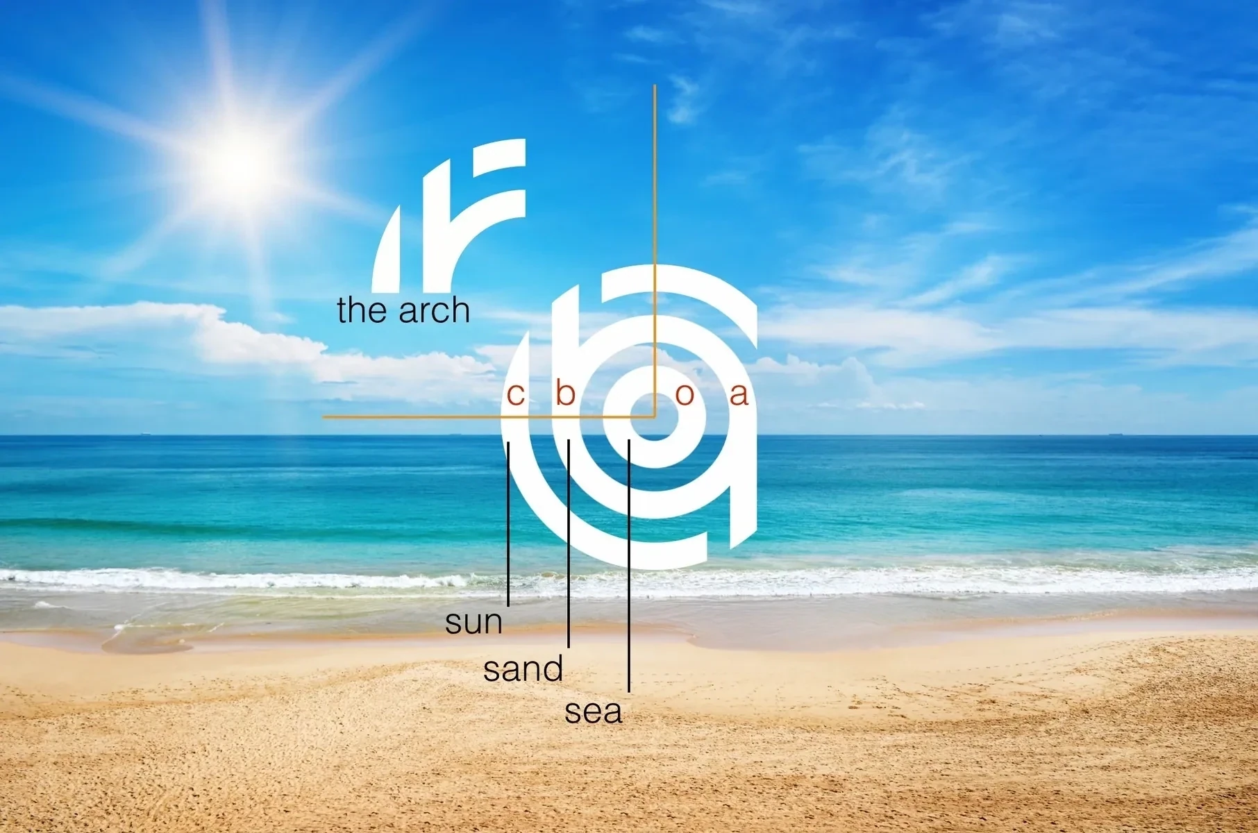
The outer circle is the C, the center circle are the A and the B, and the inner circle is the O. It`s also noticeable the order in which you can actually read the word Cabo. As in some strange symmetry or inner order, for a logo that promises to be a symbol of inclusión, for a city that does precisely that.
INCLUSION
The logo includes our beloved ARCH. In an abstract way; result of the logos same nature. You can find THE ARCH in it`s top left Quadrant.
THE VISION
The creative process circled around the idea of creating something solid, round and absolute. Something so strong and bold that could be recognizable around the globe and point out our geographical location wherever you might be, almost like a target. Something universal like the symbol @ or #.
NUMEROLOGY
The logo is formed by 3 circles, a cabalístic number that represents artistic capacity, sociability, sympathy. A symbol of communication, interacción and neutrality, optimism, happiness and the joy of life.
THE ELEMENTS
The first 3 elements that these three circles represent are: It`s habitants
1-THE CHOYEROS. Original habitants of Los Cabos, they have been living here for years in this blessed destination. Simple people and thankful for this God Given Paradise. They are the espinal cord of our Logo, the inner circle.
2-THE INVESTORS. With time it was inevitable that the world would see Los Cabos virtues. Mexican entrepreneurs came to Los Cabos to invest, build and and activate it`s now growing economy. The second circle is a whirlpool or dinamo that spins endlessly generating wealth.
3-THE VISITORS. For years wether it`s a large and growing colony of expats or Millions of visitors that come from all over the world. The tourism has come to wrap around the previous two circles, to enjoy Los Cabos way of life, and give closure to this amazing symbol. They come to live the dream, to blend in with the rest in this inclusive destination, where all coexist in perfect harmony, depending one of the other. If Los Cabos has a quality it is it`s amazing ability to make everyone welcome. Los Cabos gets people from all walks of life, with many different nationalities and socio económic levels. It really does not matter who you are, it`s easy to come here, feel welcome, take possession and find your self. An inclusive destination where we are all free.
3 MORE CIRCLES
Continuing with threes, the three circles represent 3 constant elements of Los Cabos lifestyle, elements that continue to make Los Cabos a target for may looking for a better life.
1-The Sun
2-The Sand
3-The Sea
Elements that everyone that lives here are exponed to. Gifted by amazing weather, and water all around us, these three elements give us the chance to enjoy life at its fullest no matter what your activity might be.
ORIGEN
After Odile, if there was one thing completely amazing going one was the collective effort of all of it`s people. Working together hand in hand with the same goal, bring this town back! Choyeros, Investors and an amazing group of people that were not even Mexican, that could`ve gone back home, went to the streets and embraced this city as their own. Together they all came back even stronger, solid prouder and happy the Sun came out again in everyones lives.
Being alone after Odile, with my kids being evacuated due to the damage. I could only dream also about my own personal circles to come together, I have 3 kids. Those are personal circles. At this time the logo was in it`s creative process, i was looking for something unique, Knowing that we already have The Arch as an emblemátic symbol, and the word Cabo had been used so much in everyones marketing, the idea remained to créate something original that no other city had. At this point i honestly believe theres no other city in the world that has a Logo/symbol that can read it`s own name, or includes it`s most precious elements.
So in the end, THE CABO LOGO it`s a symbol of other 3 elements:
IT`S A SIMBOL OF UNITY, INCLUSION AND STRENGTH
Or if you prefer by it`s round nature, THE SUN THAT SHINES ON ALL OF US Dedicated to my kids j
Display prices in:USD

